App listing guidelines
Once you have finished building your app, you can focus on other aspects like graphics, descriptions, and pricing! All these elements are required when submitting your app to the marketplace, so it's important to understand the requirements and guidelines for each. These guidelines help provide app users with a consistent experience and create a more efficient app review process for all developers.
Since there are many different elements to be completed, this document will break down each one, explain the guidelines and requirements, and provide valuable examples to help you complete your app submission.
Written content
App name
Requirement: 30 characters or less; no emojis
The app name is likely the first thing a user will see when they discover your app in the marketplace. Your app name should be unique and concise while also drawing viewers' attention and clearly communicating the app's functionality and value. It should not be misleading or too similar to existing marketplace apps.
When creating your app name, keep the following guidelines in mind:
- Your app name should be unique and not infringe monday.com or any other third-party existing trademarks.
- Avoid using "monday" “monday.com” or any of monday.com trademarks in your app name unless it's descriptive and follows our guidelines.
- Do not use terms that might imply endorsement by monday.com or by any other third party unless explicitly authorized.
- Ensure your app name doesn’t contain any unlawful, harmful, threatening, defamatory, obscene, or otherwise objectionable text or messaging.
Examples
| Approved app names | Rejected app names |
|---|---|
| Task Tracker for monday.com | monday.com Task Tracker |
| Team Collaboration Tools | monday Team Collaboration |
| Kanban Board Enhancer | monday Integration with Google Drive |
| Project Management Simplifier | monday.com Hours Tracker |
Descriptions
Each app has two different descriptions that customers will see in the marketplace: the short description and the long description.
When writing either of the descriptions, keep the following guidelines in mind:
- Use clear, professional, and friendly language. The tone should align with monday.com’s approachable and supportive voice.
- Concisely highlight your app's main features and benefits. Focus on its value to monday.com users.
- Ensure your app description does not make unsubstantiated claims or violate any legal or ethical standards.
- Do not use terms that might imply endorsement by monday.com unless explicitly authorized.
- Ensure your app description is original and doesn’t replicate or mimic the description of other apps in the marketplace. Please note that the text, images and other creative expressions contained in the app might be protected by copyright and that infringing other developer’s copyrights may result in your app being removed from the marketplace. Learn more in monday.com’s Copyright Policy.
Short description
Requirements: 60 characters or less
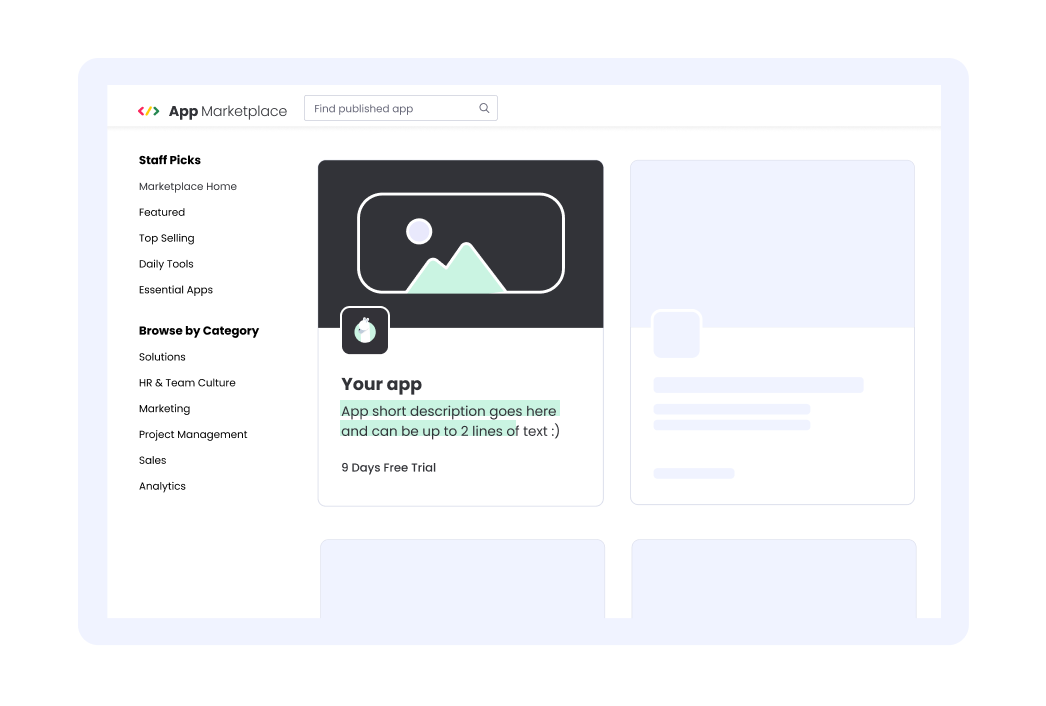
The short description appears on the app card in the marketplace, making it one of the first introductions users have to your app. It should grab readers' attention by briefly explaining what the app is, what it does, and how it will bring direct value to users. Try to write action-based descriptions using verbs like add, implement, create, update, visualize, etc.
For example: Send, sign, and store all your documents on your monday.com board!
Long description
Requirements: 200 to 2,000 characters
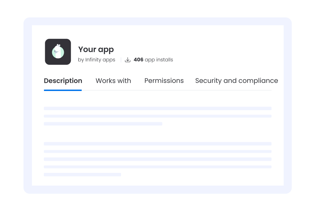
The long description appears under the main video and photo carousel on your app's listing page. It should provide more details about your app's benefits, problems solved, or possible results, preferably in a bulleted list format. You should also include specific examples or use cases to demonstrate how customers will use the app inside the monday.com platform.
Example template
Paragraph 1: Highlight the key benefit of your app, the problem you solve, and the core use case or example. Ensure that users can understand what your app does in just one paragraph.
Paragraph 2: Dive into additional benefits, share more use cases, and provide more context about your app.
Paragraph 3: Include a sentence that links to a page where users can find more details, like your help doc or app landing page.
Works on tab
Requirements: Up to 70 characters
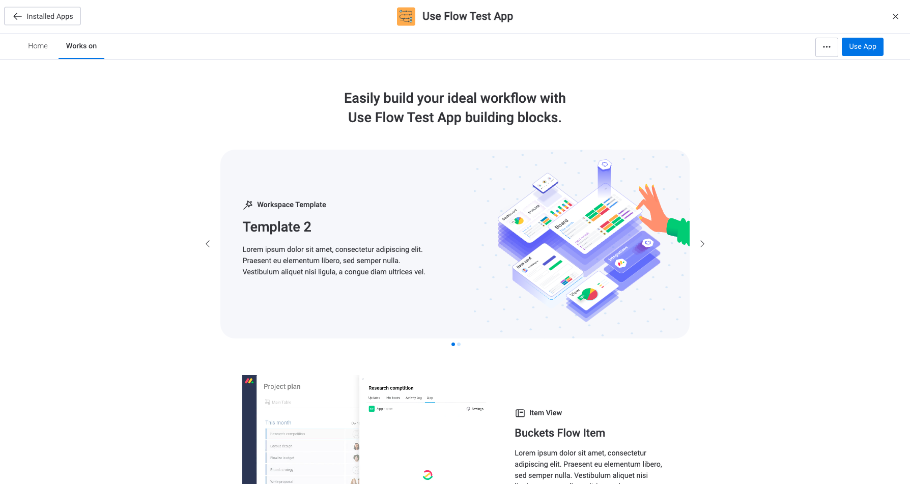
Each app feature should have a separate description that will appear in the Works on tab on the app listing card. These descriptions should outline what each feature does and how it can benefit users.
We recommend including your app name in the title to eliminate confusion and creating individual names for each app feature.
For example: ame] Item Item or ame] Board Board
Plan pricing
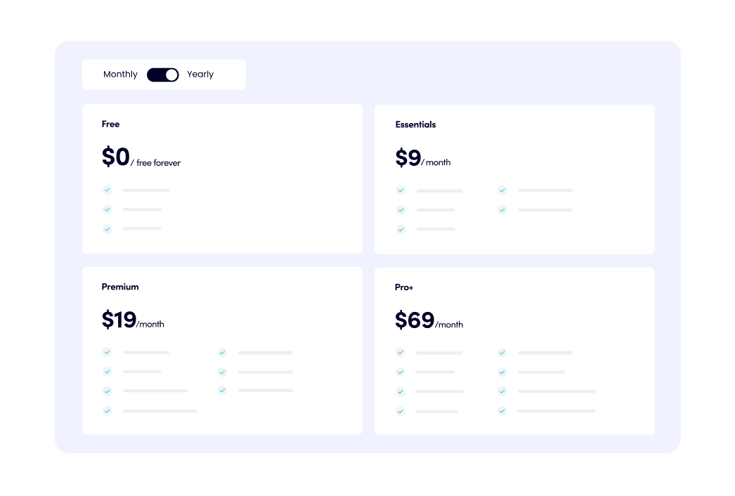
Your app's plans and pricing are shown on the app listing page in the marketplace. As part of the submission process, you need to name each plan, write a few bullet points describing what is included in each tier, and price each plan.
Each plan should be named based on the main benefit it provides (1-255 characters). For example, you could call the plans Free, Advanced, and Pro to emphasize the number of features included in each tier. You could then write brief descriptions (1-255) for every tier to explain what is included at each level.
Once you've decided on the names and descriptions, you can price each plan. Take a look at our pricing report and monetization documentation to help you price them accordingly!
Graphics
As part of the marketplace app submission process, you need to create various graphics for the app card, icon, and image gallery. Check out this template to get started, or create your own!
Icon
Requirements: JPG or PNG, 192x192px
The icon appears on the app card in the marketplace and is one of the first introductions users have to your app. It should convey the essence of your app using a single, unique element.
You can select the icon's background color and adjust the size and crop if needed. We recommend avoiding complex and small details on your icon, adding padding on all sides, and staying within the frame. Treat your icon like a business card - if it is pixelated, stretched, or vague, it may indicate that your app experience could also be clunky.
Guidelines
Keep the following guidelines in mind when designing your icon:
- Even if your app integrates with a third-party platform, you cannot use their trademarks without an applicable license or build your icon in a way that may confuse users as to the origin of the app, or that may imply an endorsement from such third parties.
- Ensure your icon doesn’t contain any unlawful, harmful, threatening, defamatory, obscene, or otherwise objectionable imagery.
- The icon should be unique and not infringe monday.com or any other third-party trademarks. Avoid logos that are similar to those of existing apps in the marketplace.
Developer icon
Requirements: JPG or PNG, 192x192px
The developer icon appears on your app's listing page in the developer section and helps users see who built each app. We will use your app icon if you do not provide a separate developer icon.
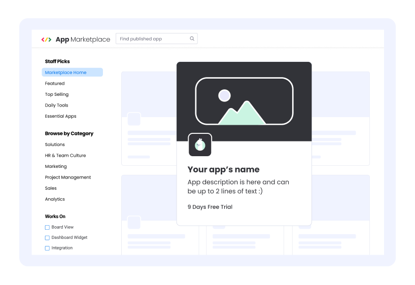
App card image
Requirements: JPG or PNG, 592x348px
The app card image also appears on the app card in the marketplace and is one of the first introductions users have to your app. It should reflect your brand and app's identity while also compelling users to click on your app card.
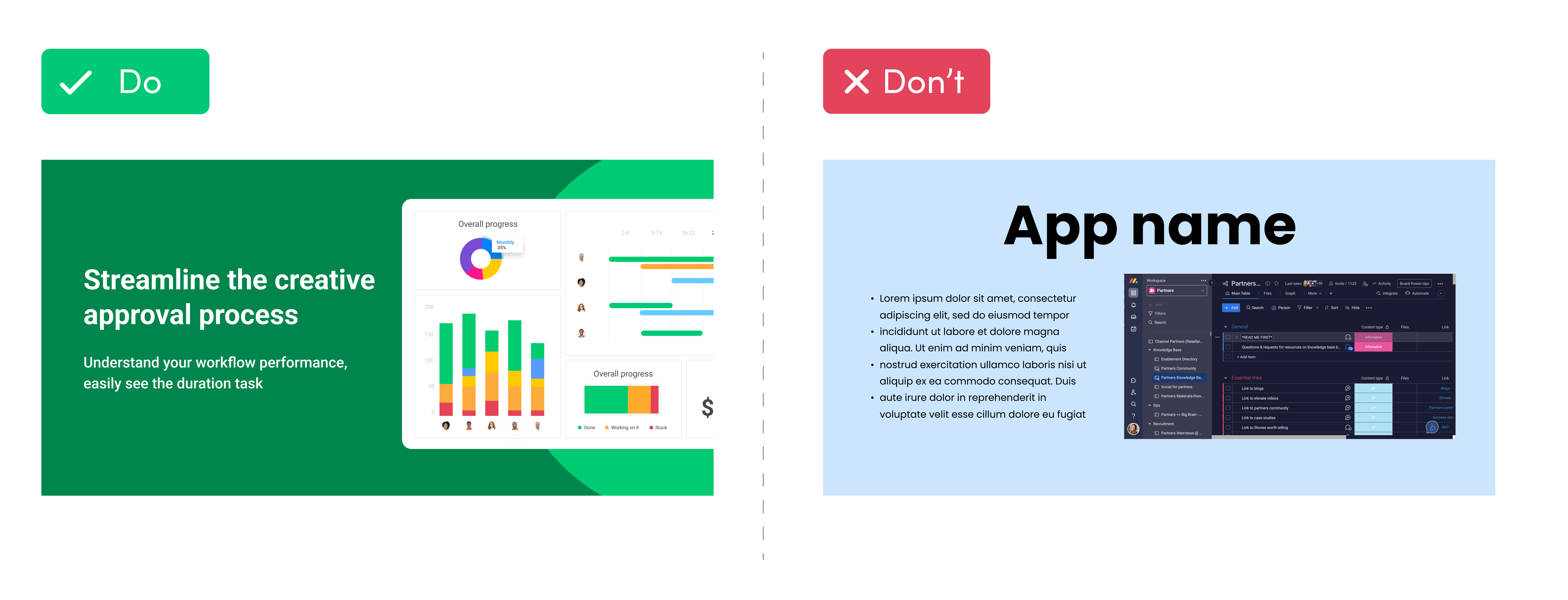
The image should be a zoomed-in screenshot of your app that clearly demonstrates your app's functionality. You can add an additional 1-2 sentences to the image that communicate your app's primary value proposition.
Because of the image size, keep your text very brief and use a big font. Avoid using long sentences, small text, complex screenshots, or using your app icon again.
Gallery images
Requirements: 3-5 images, JPG or PNG format, 1920x960px
The gallery images appear on your app's listing page in the marketplace and should highlight the app's key features and benefits, help users quickly understand the app's functionality, and reflect your app's brand.
These images should combine cropped, focused screenshots with short statements highlighting your app's benefits. We also recommend using a colored background to ensure the images stand out in all themes, including dark mode.
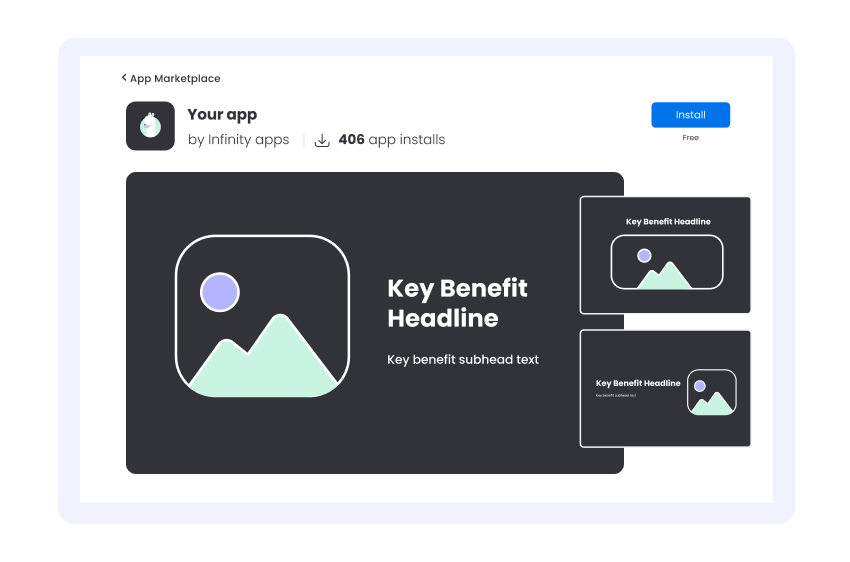
Each image should focus on one value proposition that solves one of your customer's pain points. You can write the primary value prop in the pictures and then add detailed benefits throughout the app listing page. Try to use short paragraphs to explain what the users need to know.
Video
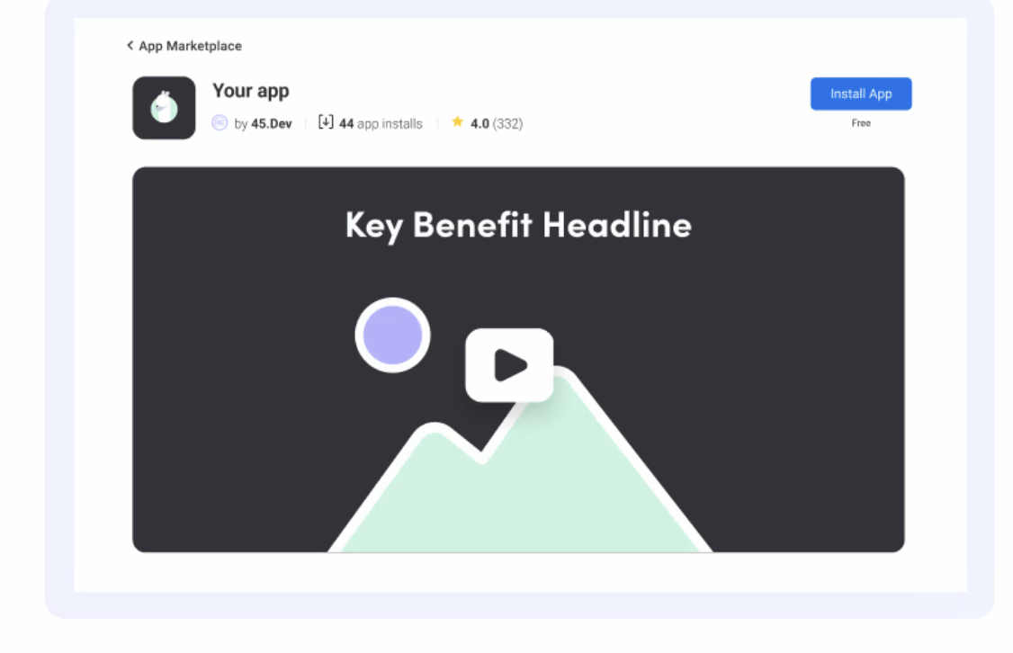
Requirements: 30-60 seconds, HD or 4K video, MP4 format, up to 50 MB
The app video appears in the image gallery on the app listing page and can help boost install rates by demonstrating your app’s features, functionality, and user interface. Remember that it's a promo video, not a demo, so it should focus on the value your app provides to customers!
The video should be accurate and high-quality to show your app's functionality as it appears on the monday.com platform. It should be up-to-date and reflective of the latest app version.
Updates to guidelines and enforcement
monday.com reserves the right to update these guidelines as necessary. If any significant changes are made to these Guidelines, Partners will be notified through monday.com’s regular channels of communication.
monday.com reserves the right to suspend an app from the marketplace if it believes, at its sole discretion, that the app developer is in breach of these guidelines. This right is in addition to any remedies that may be available to monday.com in accordance with the Terms and/or applicable laws.
These guidelines are in addition to the Marketplace Listing Terms, monday.com Terms of Service, and the Developer Terms (collectively: "Terms"). In case of an inconsistency between these guidelines and the Terms, the Terms shall prevail.
Join our developer community!We've created a community specifically for our devs where you can search through previous topics to find solutions, ask new questions, hear about new features and updates, and learn tips and tricks from other devs. Come join in on the fun! 😎
Updated 6 months ago
